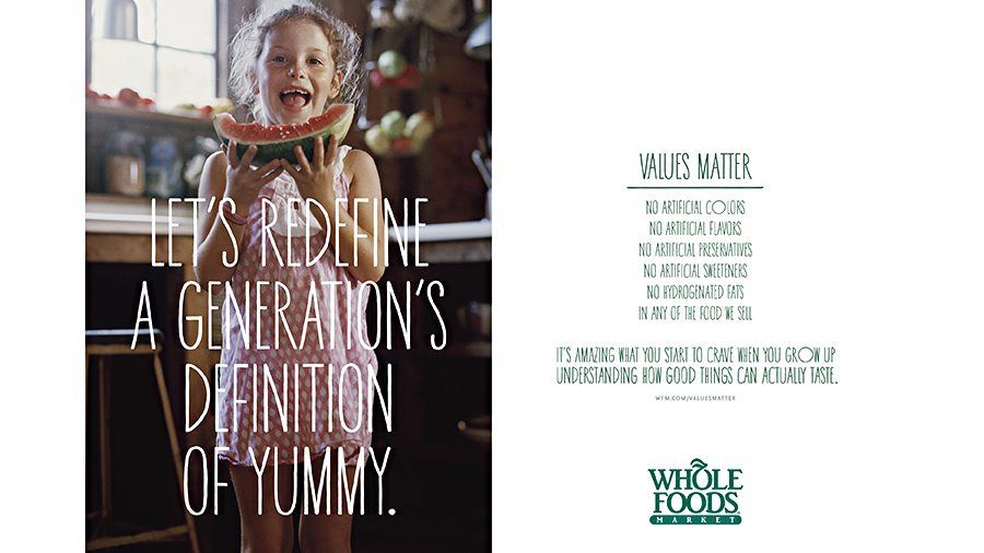
23
Oct '14
The Weird, Icky Gender Messaging of Whole Foods’ New Ad Campaign
Earlier today we linked to a great summary of some of the shortcoming’s of Whole Foods’ aesthetically gorgeous new marketing campaign — namely that it still makes them look expensive and pretentious, two things they should probably at this point be trying to avoid. Well, we missed something: the stunningly off gender messaging of some of…
Read More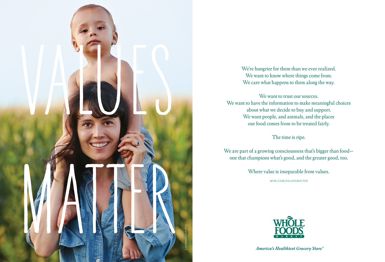
23
Oct '14
Strategy Review: Whole Foods’ Bold, Beautiful, Message-Shaky Leap into Big Money Marketing
We loved this review of Whole Foods’ first big agency-backed marketing campaign, written by the organic food giant’s 90’s-era head of marketing Joe Dobrow. Dobrow absolutely nails some of the campaign’s potential strategic pitfalls: slick cinematography that makes them come off as expensive; “Values Matter” as an out-of-date message that misses an opportunity to talk…
Read More
25
Sep '14
How do agencies self-actualize?
If you’ve worked in the marketing world — especially as a creative — you know it involves a high degree of compromise. You compromise on the original concept for one that you know will get chosen. You compromise on your favorite design for one that makes the client happy. You compromise on something that’s perfect for something…
Read More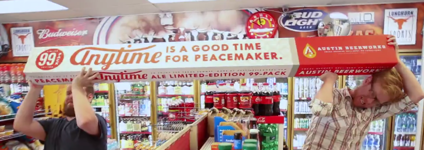
27
Aug '14
Adventures in Packaging Design: “The 99 Pack”
We’ve made our fair share of forays into the world of craft brewing — including collaborations with Surly and current main squeeze Berkshire Brewing (stay tuned for an upcoming rebrand) — but this one even blew us away a little bit. Introducing the 99-pack, from Texas-based brewer Austin Beerworks. 99 beers, 99 bucks. One very long…
Read More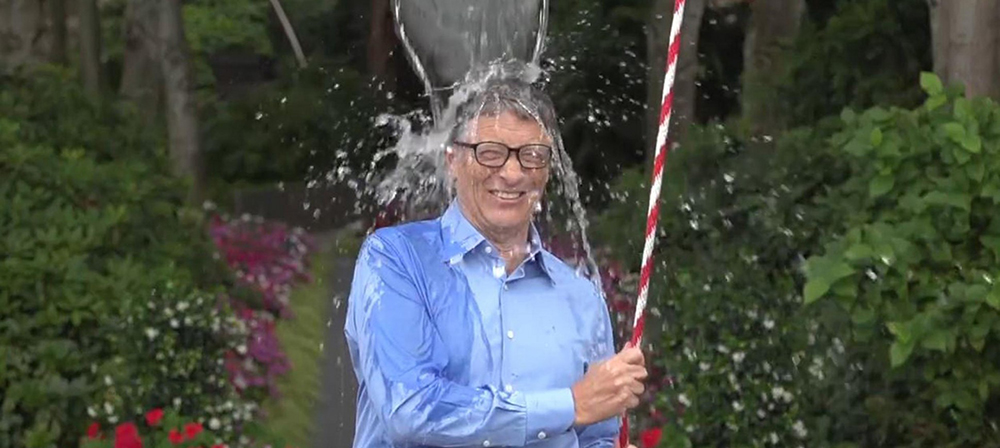
14
Aug '14
Viral Watch: The Ice Bucket Challenge
1000% spike in donations. $2.3 million total funds raised. 1 simple idea. Many lessons for marketers.
Read More
30
Jul '14
Logo Redesign Review: Airbnb
Much has been written about Airbnb’s logo redesign — some of it positive, some of it negative, a lot of it hilarious — and while the undeniable consensus is that it looks like a certain, erm, human genitalia (wait, which one?), it’s still unclear how Airbnb as a company plans to strategically move forward. Toss it or keep it? Defend…
Read More