30
Jul '14
Logo Redesign Review: Airbnb
Much has been written about Airbnb’s logo redesign — some of it positive, some of it negative, a lot of it hilarious — and while the undeniable consensus is that it looks like a certain, erm, human genitalia (wait, which one?), it’s still unclear how Airbnb as a company plans to strategically move forward. Toss it or keep it? Defend…
Read More
24
Jul '14
Responsive Logo Design: Can You Recognize These Brands At All Sizes?
As folks who do a lot of responsive design and logo work – usually separately – we love this project by London-based designer Joe Harrison. Harrison imagines six major corporate logos within a responsive design framework – so, as the user’s browser window shifts, so does the logo itself. Usually responsive design just means shoving text down to…
Read More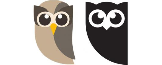
10
Jun '14
Rebrand Review: Hootsuite, Penguin Random House, McDonald’s
High level rebranding work is some of our bread and butter. We’re immersed in that process daily, with a number of clients — so we like to keep track of what else is going on in the industry. From visual to messaging, market analysis to creative — who’s doing what? And where’s the really great work? Here…
Read More
28
May '14
Massimo Vignelli (1931-2014)
Massimo Vignelli, modernist designer and creator of the NYC Subway map and American Airlines logo, has died. More coverage at The New York Times, Gizmodo, Design Week.
Read More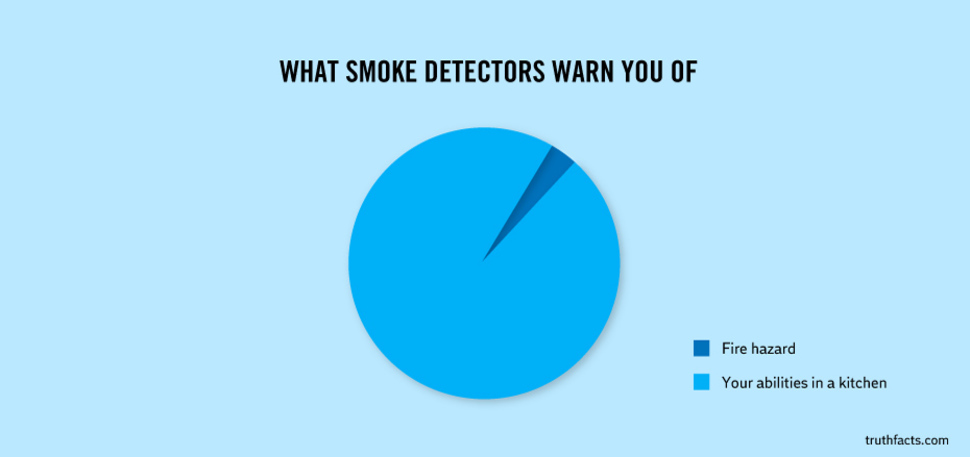
29
Apr '14
34 Graphs That Hilariously Capture Everyday Truths
We thought these, from Danish artists Mikael Wulff and Anders Morgenthaler, were pretty great. See the rest over at Distractify.
Read More
08
Apr '14
7 Things We Like & Don’t Like This Week in Strategic Marketing/Creative
And now, this week’s edition of 7 Things We Like and Don’t Like, featuring a heavy dose of fonts – and at least one mandatory Game of Thrones reference. 1. Font Men. The new documentary featuring font-creators and (former) collaborators Jonathan Hoefler and Tobias Frere-Jones . 2. The Arrival of Ryman Eco – “the world’s most beautiful sustainable…
Read More